
If you perform an RNA-Seq assembly with replicates and specify DESeq2 as the normalization method, SeqMan NGen version 17.6 and later autogenerates editable output files for a variety of plots for genes and isoforms. Looking at plot results can verify whether your data was a good fit to the shrunken estimated modeling that takes place in DESeq2.
File locations and formats:
The files are located in two subfolders of the SeqMan NGen output subfolder called Bioconductor-output, and are automatically prepared during the RNA-Seq assembly by a Bioconductor pipeline that works together with SeqMan NGen. The sub-folders are named results-gene and results-isoform, and each contains a number of .csv and .pdf files as shown in the example below:

- The .csv files can be opened using a spreadsheet application such as Microsoft Excel or Google Sheets.
- The .pdf files contain vector graphics and can be edited by opening them in Adobe Acrobat and clicking Edit a PDF in the left margin. Text labels may overlap at first, and you will likely need to move them or shorten their names to correct this issue. Note that the .pdf files can also be opened as static images in applications such as Microsoft Word or PowerPoint.
File formats and uses:
Plots in the folder may include:
- Volcano plots – used to identify events that differ significantly between two groups of subjects. The x-axis of this type of plot is the fold change (log~2) and the y-axis is the -log~10 p-value. Genes with decreased expression appear as points on the left of zero on the x-axis, while those with increased expression appear on the right. Points further from zero indicate more change than those closer to zero. The most significant data points appear at the top of the plot.
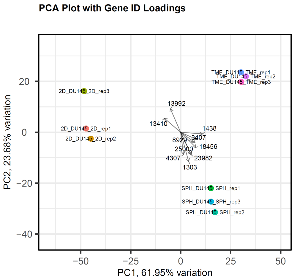
- Principal component analysis (PCA) plots – showing the correlations between each of the principal components and the original variables. The plot is used to elucidate which variables (“loadings”) affect the principal components, and in which direction. To learn more, see PCAtools: everything Principal Component Analysis.
- MA plots (a type of Bland Altman plot) – a scatter plot that displays the relationship between the mean and log ratio of two variables. The vertical axis, or “M”, represents the minus log ratio, and the horizontal axis, or “A”, represents the average log ratio. MA plots can be used to assess the outcome of normalization and to compare the intensity measurements from two channels, such as red and green channels on a microarray. They are also used to determine whether intensity differences between a microarray and a reference microarray are dependent on the magnitude of the intensity values.
- Dispersion estimate plots – a visual representation that illustrates how the variability (or spread) of data points changes in relation to their average value. In this plot, the x-axis typically represents the mean expression level, while the y-axis displays the dispersion estimate. In RNA-Seq analysis, this plot can help assess the relationship between gene expression levels and their variability. Examining the plot trend can help you identify genes with unusually high or low variability compared to their average expression.
- Plots comparing individual samples to a control
- Plots calculated using different normalization methods (rlog vs. VST)
- Plots that have been “shrunk” (i.e. had the y-axis shortened) to improve visualization and data interpretation
To learn more about the file types and what they are used for, see Analyzing RNA-seq data with DESeq2.
The following example image shows a PCA plot generated using data output from a SeqMan NGen RNA-Seq assembly. The experimental data consisted of three replicates each for three time-based samples from the prostate cancer data set DU145. The plot demonstrates that the replicates are very tightly correlated and that there is a good separation between the different time points.
Need more help with this?
Contact DNASTAR